Event page color contrast checker: test text and interface colors
A date, venue instruction or ticket button can disappear for some readers when its foreground and background are too similar. Enter the two solid colors below to calculate their contrast ratio, then check the actual published event page. The calculator is a quick screen for one color pair, not a certification of the page.
Boletolibre editorial team
Published
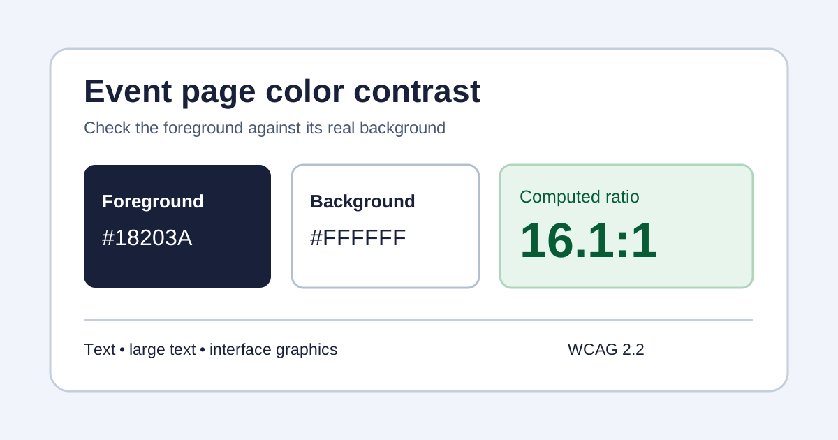
Use the interactive checker
Open the interactive event-page color contrast checker (English)
Open the checker, enter six-digit foreground and background hex values, or use its color pickers. It displays the ratio and separate outcomes for normal text, large text, enhanced text and essential non-text interface graphics. The decision is made from the unrounded ratio, even though the display shows two decimals. Swap in the actual colors used behind a date, price, registration instruction, link, button label or status message.
Read the thresholds correctly
WCAG 2.2's minimum text criterion uses 4.5:1 for normal text and 3:1 for large text. The enhanced criterion uses 7:1 and 4.5:1 respectively. Necessary visual information in interface controls and graphics generally needs 3:1 against adjacent colors under the non-text criterion. Large means at least 18-point regular or 14-point bold in the standard, not simply whichever text looks prominent on your screen. A ratio just under a threshold fails that threshold; do not round it up.[1][2][3]
Check the event journey, not just the palette
Prioritize the path an attendee must read: event date and time, location and access directions, price, ticket choice, registration fields, validation errors, confirmation and help contact. Inspect the real browser rendering at mobile and desktop widths. A solid-color calculator cannot account for photos, gradients, transparency or a patterned backdrop; check the least legible portion of those elements on the actual page. Test focus, hover and error states separately where the color carries information. If checkout is hosted elsewhere, include that handoff and the supplier's own interface in your review.[1][3]
Record fixes and retest
For each problem, note the URL and state, foreground/background colors, observed ratio, applicable criterion, owner and retest result. Changing a design token can affect many pages; review all places that use it. Keep keyboard access, labels and other accessibility checks in the same release review. If your event appears on Boletolibre.com, verify its published event information and ticket path as attendees see them; the organizer's own site and any external checkout need their own checks.
Sources and further reading
- Understanding SC 1.4.3 Contrast (Minimum)W3C WAI · Accessed
- Understanding SC 1.4.6 Contrast (Enhanced)W3C WAI · Accessed
- Understanding SC 1.4.11 Non-text ContrastW3C WAI · Accessed