How to build an event registration page: promises, fields and truthful confirmations
An event registration page helps a visitor decide whether to attend and what action to take. The page explains the offer; a form collects information; a separate service may handle payment or tickets. Design the journey so each public promise matches what the organizer can actually deliver.
Boletolibre editorial team
Published
Decide what the action actually does
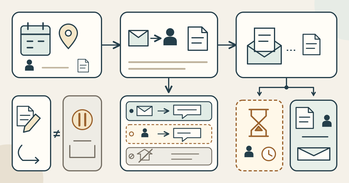
Start with a precise action: ask for information, request a place, apply for approval, register directly or continue to an identified external checkout. Use button wording that matches that action. If a person must review the request, do not label submission as confirmed admission. Assign an owner to the action and identify the record that proves its result.
- Event facts: audience, organizer and contact, what is included or excluded, date, start/end time and named time zone.
- Arrival and support: actual venue/address or online access method, verified access information and a route for assistance requests.
- Offer conditions: actual price and currency, charges and restrictions, what the action creates, and where change/cancellation terms can be read.
These are editorial launch checks, not a universal list of legally mandatory fields. Ticketmaster’s US-facing standard-ticket policy illustrates why offer-specific checking matters: pricing can include applicable fees and taxes, and restrictions vary. Its contract is not global pricing law or evidence that your event uses the same terms. Verify the actual offer rather than copying another seller’s policy.[5]
Give every retained field a reason
Keep a field-purpose ledger: intended use, why the information is needed, required or optional status, who receives it, retention/review criterion and responsible owner. Ask whether collecting it later would work. Adequate information is not necessarily the fewest possible fields, and there is no ideal field count for every event. UK ICO minimisation guidance addresses relevant, sufficient information limited to specified needs under UK GDPR; it is not a rule automatically governing every registration worldwide.[1]
Explain required items and the consequence of leaving them blank. The ICO’s selected UK transparency guidance covers controller contact, distinct purposes, applicable lawful basis and retention information. Use it within its UK scope, not as a complete global privacy notice. Sensitive-data handling and applicable marketing rules need separate assessment. A registration request does not by itself justify marketing enrolment, and an access request should not automatically demand a diagnosis.[2]
Design the message from the recorded state
- Request received: acknowledge receipt and explain that a decision is pending, with a real contact or next step. Do not imply approval, payment, a ticket or a reserved place.
- Approved: state the organizer’s actual approval and any remaining conditions, based on its recorded allocation. Do not claim unrelated payment has completed.
- Unavailable: explain the real unavailable or waiting process and contact route without pretending a place is confirmed.
- External paid process: name the external service and communicate only its verified outcome. A click or form submission alone proves neither payment nor admission.
This is an original process-review model, not an assertion that a particular platform implements these states. Decide which message or document actually confirms a place or purchase and test it. Do not invent a response-time guarantee just to make the success screen sound reassuring.
Separate answer errors from service outcomes
GOV.UK’s government-service design guidance recommends labels and useful hints, rather than relying on placeholder-only instructions. Its error guidance explains what went wrong and how to correct it while preserving answers. Treat these as practical design references, not certification of your page or a worldwide legal checklist.[3][4]
An invalid email format is an answer the visitor can correct. No available allocation is a service outcome; it should not appear as “enter a valid email.” Explain the actual situation and the next route instead. Likewise, a request awaiting review is not a broken form. Review the page, form and downstream message together so the visitor is not asked to solve the organizer’s availability problem.[4]
Worked example: a free workshop with manual review
“Repair Lab” is a fictional adult-beginner workshop on 12 November 2026, 18:00–20:00 America/Mexico_City, in a fictional Community Room. Visitors bring one small repair item; tools are loaned and repairs are not guaranteed. It is free and has no checkout or ticket issuance. The team must verify the actual address, room and access arrangements before a real launch; this is not an event listing.
The button says “Request a place.” A reply email is required only because this example sends manual decisions by email; provide another contact route if needed. Preferred name and broad repair-item category are optional. No purpose has been established for birth date, home address or employer, so omit them. Offer a private access-request route rather than a mandatory diagnosis field. These choices follow this workflow, not a universal form template.
On receipt, the page states that review is pending. Only an explicit organizer approval matching the recorded allocation confirms a place, subject to stated conditions. If no allocation is available, give the real next step rather than a validation error. If price, venue or process changes, reopen the corresponding facts, fields and messages before publishing new promises.
Test the whole journey, not just the submit button
- Use a narrow-screen viewport and a keyboard path to check readable facts, labels, hints, links and the action destination.
- Try a correctable answer error, then verify the entered information is retained and the feedback gives a useful correction.
- Run received/pending, approved and unavailable paths; compare the displayed message with the actual record and owner decision.
- If using external checkout, check the handoff and genuine confirmation separately; do not infer payment from a return link alone.
- Record each discrepancy, evidence, owner and resolution. Keep unanswered promise/process issues open before launch.
Publish only what those checks substantiate. Registration-page quality is the agreement between the offer, the information collected and the result communicated—not a guaranteed conversion rate, privacy-compliance badge or proof of native payment, reservation or ticketing features.
Sources and further reading
- Data minimisation — UK ICO guidanceUK Information Commissioner’s Office · Accessed
- Privacy information — selected UK ICO guidanceUK Information Commissioner’s Office · Accessed
- Text inputs: labels and hints — GOV.UK Design SystemGOV.UK Design System · Accessed
- Error messages and service outcomes — GOV.UK Design SystemGOV.UK Design System · Accessed
- Standard Purchase Policy: pricing and restrictions — US-facing exampleTicketmaster · Accessed