Choose a web font loading strategy for an event website
The event name may use a distinctive display face, while date, venue, price and ticket controls must remain readable as soon as possible. A font strategy decides which files are needed, when the browser finds them, what visitors see while they load and whether text jumps after a swap. No single `font-display` value or preload list fits every event page and language.
Boletolibre editorial team
Published
Inventory fonts by task and language
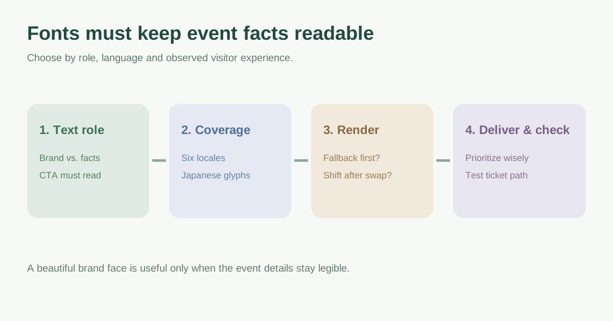
List the actual font families, weights, styles and files used on the event landing page, registration and ticket handoff. Separate a brand display face from the body font used for practical details. Check every locale: English, Spanish, German, French, Japanese and Dutch may need different glyph coverage and fallbacks. A Latin-only subset that looks fine in English can leave Japanese event facts unreadable or inconsistent. web.dev notes that language subsetting can reduce download size but CJK coverage is more complex; check the font license before altering or self-hosting files.[1]
| Text role | Decision to record |
|---|---|
| Event name/brand | Is the exact face essential at first view? |
| Date, venue, price and CTA | Which fallback remains readable immediately? |
| Registration/form labels | Do all required glyphs and weights render? |
| Six language routes | Which file/subset and fallback cover each script? |
Choose what appears while the web font loads
`font-display: swap` shows fallback text quickly and later uses the branded font, but the change can move nearby text when font metrics differ. `font-display: optional` may keep the fallback for that visit when the web font is late, favoring stability at the cost of brand consistency. `block` can delay visible text. Match the setting to the role: a decorative headline can tolerate a different tradeoff than price or registration instructions. Do not hide critical event facts while waiting for typography.[1]
Compare fallback and web-font line breaks at narrow widths and in long translations. Similar fallback metrics, or carefully chosen metric overrides when your implementation supports them, can reduce shifting. A font choice should preserve readable text and a stable ticket action, not only a visual mockup.[1][2]
Load only the files needed for the first task
Inspect the network to see when critical CSS and font files are discovered. Font declarations alone do not force a download; the font is requested when matching styled content is used. Prune unused weights and styles, prefer appropriate compressed files, and check whether the provider already serves language subsets. For a third-party font service, an early connection may help; compare it with a properly configured first-party delivery rather than assuming one is always faster.[1]
Preload only a font file proven important to the initial view. Preload competes with other event-page resources and can bypass language-based selection. If the large poster or key content is delayed after a font preload, reconsider the priority. Keep source, license, update owner and cache behavior documented.[1]
Compare the first visit and the attendee journey
Use a fresh-cache phone test in each locale, then compare repeat visits. Record when event name, date, venue and price become readable, whether a late font swap moves the CTA, and whether Japanese or accented names show missing characters. Check registration validation and ticket handoff too. Measure under the same conditions after a change; a brand font that arrives faster is not an improvement if the ticket button shifts or necessary text disappears.[1][2]
Download the event website font decision worksheet (Markdown, English)
Sources and further reading
- Best practices for fontsweb.dev · Accessed
- Optimize Cumulative Layout Shiftweb.dev · Accessed