Japanese event website typography checklist
A Japanese translation can be accurate while the page is still hard to use. Event names, dates, Latin-script sponsor brands, ticket codes and URLs can wrap badly in narrow cards. Review the actual rendered page with Japanese content at the widths and states attendees use; do not apply a fixed font-size or line-length formula to every design.
Boletolibre editorial team
Published
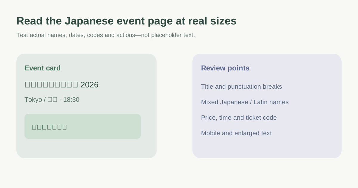
Review the real event content, not a placeholder
Create test cases using the longest approved Japanese event title, venue name, session title, speaker name, price and ticket-label text. Include mixed Japanese and Latin brand names, numerals, times, a long URL or code, and punctuation. Test a sold-out state and any postponement notice as well as the normal ticket path. Mark where a line wraps into the wrong visual group or covers a primary action. The leading Google result discusses Japanese and Latin text together, but its fixed percentage font and line-height adjustments are design examples from 2016, not universal settings.[1]
| Surface | Stress text to inspect | What to watch |
|---|---|---|
| Event title and card | Long Japanese name plus Latin series name | Unexpected wrapping or clipped title |
| Date and venue | Japanese text, digits and time zone | Separation of date, time and place |
| Ticket selector | Tier name, price, sale state | Action and price remain distinct |
| Confirmation | Name, code, link and instructions | Copyable details and readable mixed scripts |
Inspect line breaking and punctuation at small widths
Japanese text normally has many character-level wrap opportunities, but punctuation and adjacent characters carry line-start and line-end restrictions. W3C describes these rules and the mixed Japanese/Western composition problem. Let the browser use appropriate language-aware wrapping first; inspect the exact result before trying CSS `line-break` values. An aggressive `word-break: break-all` or `line-break: anywhere` override can solve one overflow while producing awkward breaks elsewhere.[2][3][4]
At mobile widths, check opening and closing brackets, dates, Latin ticket IDs and sponsor names. When a long nonbreaking string forces overflow, choose a scoped treatment for that component rather than globally changing all Japanese paragraphs. Read the page with zoom and larger text settings as well; a tidy screenshot at one width is not proof of readable content.
Check font coverage, weight and emphasis
Inspect the fonts actually rendered for kanji, kana, Latin letters and symbols. Missing glyphs or abrupt fallback can make mixed names look broken. Use emphasis that works in Japanese; avoid relying on forced italic styling of Japanese text. Compare headings, body text, buttons and inline labels at usable zoom levels, and keep contrast and hierarchy clear. Do not shrink Japanese text by a fixed percentage just to mimic a Latin layout—the page must remain readable.[1][3]
Ask a Japanese-literate reviewer to check meaning, spacing, line breaks and event-specific conventions. A technical overflow check cannot establish editorial naturalness. Record component, viewport, screenshot or URL, issue, decision owner and recheck date.
Verify the published attendee path
Open the live Japanese event page and follow event discovery, details, ticket selection, checkout handoff and confirmation where feasible. Repeat on a narrow mobile screen and at increased text size. Check that language metadata and visible Japanese content agree, that the ticket price and time remain clear, and that the actual submitted attendee details are not changed by visual fixes. Re-review when the event title, venue, price or schedule changes.
Download the Japanese event-page typography QA sheet (Markdown, English)
Sources and further reading
- Seven rules for perfect Japanese typographyAQ writes / Medium · Accessed
- Approaches to line breakingW3C Internationalization · Accessed
- Requirements for Japanese Text LayoutW3C · Accessed
- line-break CSS propertyMDN Web Docs · Accessed