Prevent layout shifts on event ticket pages
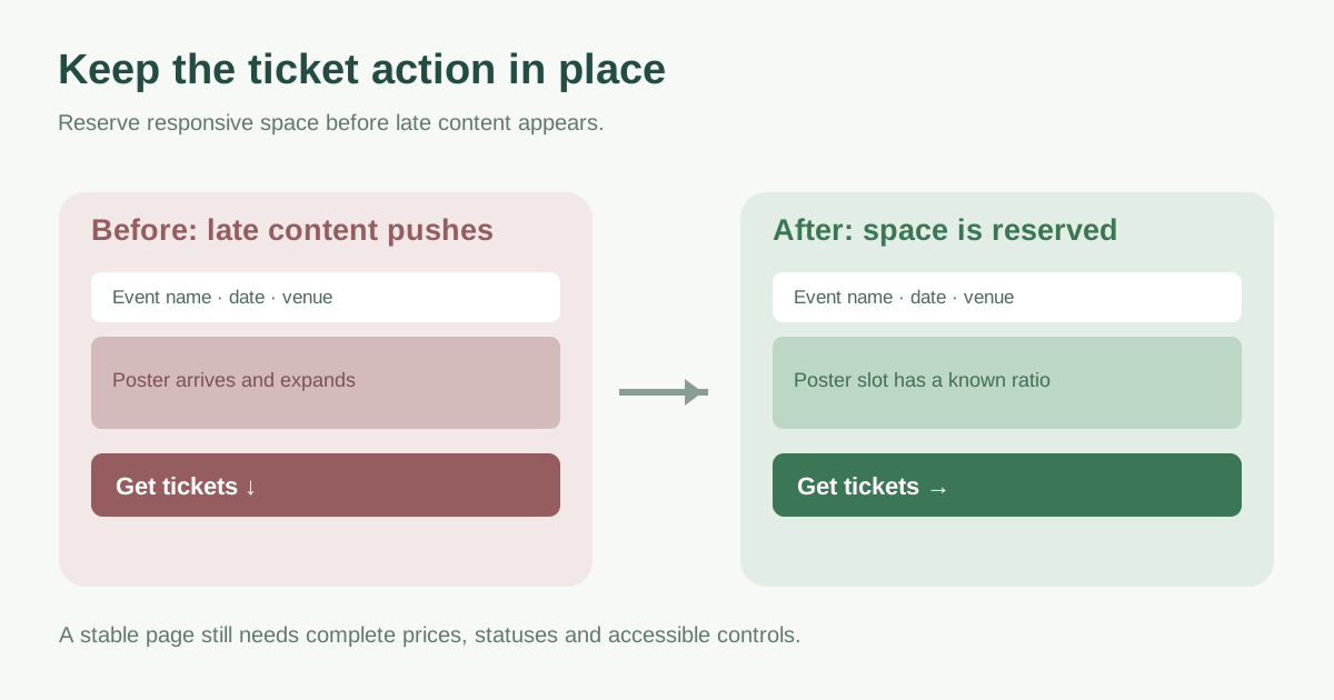
A visitor aims for “Get tickets,” then a late poster or widget pushes the button away. That is a page stability problem, even if every resource eventually loads. Fix the element that created the movement, preserve space before late content arrives and repeat the ticket journey on a narrow screen. This guide turns CLS diagnosis into a concrete layout review for event landing and purchase-entry pages.
Boletolibre editorial team
Published
Find the shift and the element that caused it
Record the event URL on mobile and desktop from first load through scrolling, ticket selection, consent choice and inventory refresh. Compare field CLS with a local load-only check where both exist. web.dev notes that field measurement covers the full page visit while a default lab run may only capture loading; a late widget can be missed in the latter.[1]
Use a layout-shift recording or DevTools Performance view to find the moment of movement. The element highlighted as shifted may be below the true cause: for example the ticket button moves because a banner was inserted above it. Note the new element and its parent container before choosing a fix.[1][2]
Reserve the space the page already knows it needs
Give the event poster and responsive photos intrinsic width and height or a correct aspect ratio so their slot exists before the image downloads. Keep responsive crops consistent with the dimensions declared for each layout. Do not put an arbitrary fixed height on a long translated event title or accessibility details; these must be allowed to grow without hiding text.[1]
| Late element | Stable-space decision |
|---|---|
| Poster or hero image | Declared dimensions or aspect ratio that matches the displayed crop |
| Ticket widget or iframe | Responsive container with a realistic reserved region and visible loading state |
| Consent notice | Known placement that does not unexpectedly push the ticket action |
| Availability or price message | Reserved status region near the control, with clear live text |
Review the ticket controls and changing content
Ticket vendors may render a selector after their script loads. Agree on an integration layout and test the actual tier count and mobile width; a placeholder must not clip prices, options or accessible controls when the widget grows. If the provider cannot give a predictable size, consider a clear handoff link or a stable dedicated section rather than injecting a large widget above the primary CTA.
Treat “sold out,” price and validation messages as designed states. Place them near the relevant control with a layout that anticipates their appearance; do not hide a meaningful status merely to improve a score. Cookie banners, translated labels and font swaps can also change line lengths, so test the longest language and real phone viewport. web.dev identifies embeds, injected content and web fonts as common shift causes.[1]
Check both the score and the ability to buy
Repeat first load and post-load actions after the layout change. Confirm the date, venue, ticket price, chosen tier and CTA stay legible and operable with keyboard and touch. Check that the page does not slide under a finger during a tap. A field report may lag or group several URLs, so record which URL and test state the evidence represents and keep watching real-user data where available.[1]
The downloadable worksheet maps each observed movement to its cause, reserved-space choice, owner and post-change ticket check. Use it alongside the Core Web Vitals explainer for the metric definition; this page focuses on preventing the specific movement.
Download the ticket-page layout stability worksheet (Markdown, English)
Sources and further reading
- Optimize Cumulative Layout Shiftweb.dev · Accessed
- Analyze runtime performanceChrome DevTools · Accessed