Compare recurring event results fairly: a two-edition scorecard
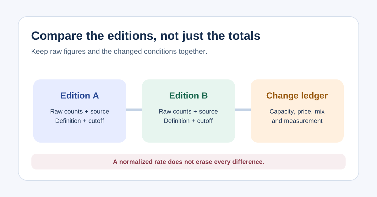
“Attendance rose” may say little if the venue doubled, the ticket price changed or last year’s check-in scan missed a gate. Use this two-edition scorecard to keep raw totals, denominators and changes together before calling a result better or worse. It complements a single-event report, which compares one edition with its plan.
Boletolibre editorial team
Published
Define what is genuinely comparable
Download the two-edition event comparison scorecard (Markdown, English)
Choose editions with a similar purpose and audience, then state what differs: venue, date, duration, programme, sales window, currencies and access model. Freeze a reporting cutoff for both. Define “registration,” “paid ticket,” “checked-in person,” “order” and “capacity” consistently; an order can contain several attendees and a refunded ticket should not be silently counted as a valid sale. Eventbrite’s help distinguishes order status from attendee check-in and describes reports that include only checked-in tickets. If scan coverage differed, say that attendance is not directly comparable.[1][3]
Keep raw totals beside normalized measures
Show both absolute numbers and a clearly defined ratio when useful. For example, report checked-in people, available places, and checked-in people divided by the relevant capacity; show confirmed registrants separately from check-ins. For no-show analysis, say whether the denominator is valid registrations or issued tickets, and include complimentary places if they were eligible. A rate can clarify a venue-size change, but it cannot make every edition comparable. Keep the raw counts visible so a smaller event with a higher fill rate is not automatically called greater demand.[2]
Record changes that may explain the result
Use the change ledger to note capacity restrictions, ticket tier mix, price, free allocations, marketing spend, competing dates, weather, programme, venue location and data-collection changes. Do not “adjust” revenue by an invented multiplier and declare causality. Compare like ticket categories where possible and show paid versus complimentary attendance separately. If prices or currencies changed, state which figures are gross, net and local-currency, with a finance-reviewed basis before calculating a cross-year growth percentage.[1]
Compare feedback and operations with care
Survey percentages need their own denominator, question wording and respondent scope. If the wording, scale or invited audience changed, show results side by side but do not label the difference a trend. SurveyMonkey notes that repeated surveys are easier to compare when questions are consistent. Operational measures such as check-in wait, support volume or incident count also require stable definitions and coverage; a new reporting process may raise the count without worsening the underlying experience.[4]
Write a decision, not a victory headline
Finish with three columns: observed change, plausible explanation and next decision. “Checked-in count increased by 90 while capacity rose by 200 and the paid/free mix changed” is more useful than “attendance up.” Mark low-confidence comparisons as not comparable. Name the source, cutoff, owner and next test for each decision. A dashboard is a starting point; the purpose of benchmarking is to choose what to repeat, investigate or change for the next edition.
Sources and further reading
- Event Performance Benchmarks: What Event Teams Should Be MeasuringMomentus Technologies · Accessed
- Download your Check-ins reportEventbrite Help Center · Accessed
- Glossary of order and attendee statuses in event reportsEventbrite Help Center · Accessed
- Analyze Multiple Surveys TogetherSurveyMonkey Help Center · Accessed