Event website information architecture: map the paths attendees need
An event website is easy to overfill: organizer news, sponsor material, venue notes, ticket rules and a program all compete for the same menu. Information architecture (IA) is the way those pieces are grouped, named and connected so a visitor can answer a question or finish a task. The leading Google guide on IA treats a sitemap as a product of understanding goals, content and relationships, not the whole exercise. This event-specific method gives you a small working map and a way to check it before building pages.
Boletolibre editorial team
Published
Start with attendee questions and one organizer goal
Write down the questions a first-time visitor asks before they trust a ticket link: What is this event? When and where is it? What happens there? Can I attend and what does it cost? How do I get there? What if I need accessible entry or help? Add the organizer outcome—usually a completed registration or ticket purchase—without letting that goal hide the answers people need first.
| Visitor task | Answer the site must expose | Likely destination |
|---|---|---|
| Decide whether to attend | Date, place, audience and program summary | Event overview |
| Plan arrival | Address, travel, entry and access details | Plan your visit |
| Choose an option | Ticket types, price and key conditions | Tickets |
| Resolve uncertainty | FAQ, contact and policy route | Help |
UXmatters emphasizes aligning business intent, user intent and available content before drawing navigation. For an event, a high-priority question may need a route from the home page and a contextual link from another page, even if it appears only once in the primary menu.[1]
Inventory content before naming pages
Make a simple sheet with one row per content item: current URL or draft, attendee question answered, owner, last review date, destination and status (keep, merge, rewrite or retire). Include PDFs, schedule embeds, ticket terms, venue maps and confirmation emails; these often contain facts missing from the public pages. Resolve conflicting times, prices or addresses before deciding where the text lives.
| Content item | Question answered | Owner / review date | Action / destination |
|---|---|---|---|
| Venue address and arrival notes | Where and when do I enter? | ____ / ____ | Keep / Plan your visit |
| Ticket terms and prices | Which option can I buy? | ____ / ____ | Rewrite / Tickets |
| Old sponsor announcement | Does this help this year’s attendee? | ____ / ____ | Retire or archive / ____ |
Do not create a page for every item. Group content by the job it helps someone do. A large annual conference may need separate schedule, speaker, venue and accessibility pages. A one-night event may put the same answers in anchored sections on one landing page; the relationships and routes still need planning.
Draw the page and link map
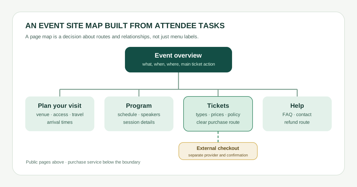
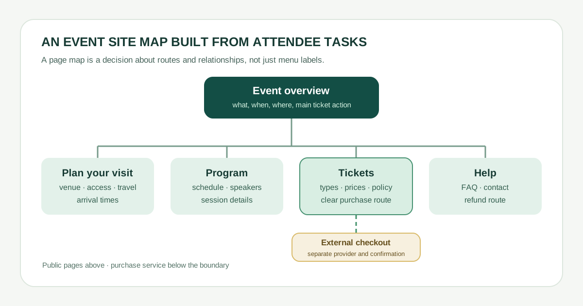
Use the diagram as a starting point, then replace its labels with the words your audience uses. Make the event overview the entry point, with routes to visit details, program, tickets and help. From each destination, add useful cross-links: a session to its ticket option, the venue page to accessibility details, the FAQ to the relevant policy. W3C WAI says navigation menus should reflect the underlying site structure and have understandable labels; do not make the menu compensate for a confusing content model.[2][3]
- Mark each node as a public page, section anchor, form or external service. A ticket-provider checkout and its confirmation page are not automatically part of your site; label the transition and check the return route.
- For each node, write its primary question, owner and next action. If two nodes answer the same question, decide whether one is canonical and the other links to it.
- Keep the important paths visible without an extra menu hunt: overview → tickets → checkout; overview → visit → entry/access; overview → program → relevant ticket.
Test findability before polishing the design
Ask someone unfamiliar with the event to use a sketch or preview. Give tasks, not page names: “Find the accessible entrance,” “Find the Saturday start time,” and “Choose the ticket that includes the workshop.” Observe the first link they choose, where they hesitate and whether they reach a trustworthy answer. Try the route on a phone and with keyboard navigation as well; a correct sitemap cannot rescue an unusable menu.
| Task | Expected route | Observed route / hesitation | Change owner / date |
|---|---|---|---|
| Find accessible entry | Overview → Plan your visit → Access | ____ | ____ |
| Check a session time | Overview → Program → Session | ____ | ____ |
| Buy the right ticket | Overview → Tickets → provider checkout | ____ | ____ |
If people miss a destination, revise the label, grouping or contextual link, then retest the task. Once the event changes, revisit the map: schedule updates, sold-out tiers and venue changes can make a previously sound path misleading. The diagram is a working editorial tool, not a one-time deliverable.
Sources and further reading
- Creating a Web-Site Information Architecture in Six StepsUXmatters · Accessed
- Menus TutorialW3C Web Accessibility Initiative · Accessed
- Make the Site Hierarchy Easy to Understand and NavigateW3C Web Accessibility Initiative · Accessed