Event email preference center example: useful choices and a clear exit
An event attendee may want ticket confirmations for a current booking but no promotions for next season. A preference center should make that choice understandable and easy to change. The first organic Google result shows eleven general preference-center patterns; this original event example narrows them to the few choices an organizer can actually honor. The sample wireframe and editable worksheet are a design brief, not a working subscription system.
Boletolibre editorial team
Published
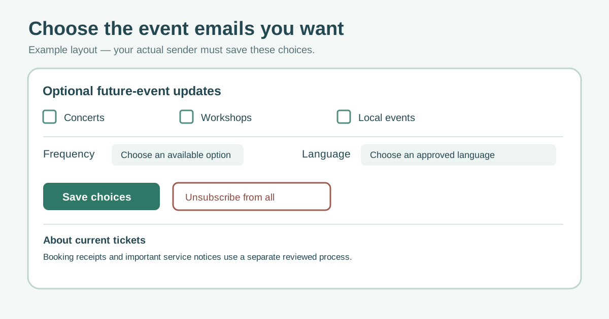
See the event preference-center layout
Download the event preference-center field and behavior worksheet (Markdown, English)
The original diagram shows a small page with separate boxes for future-event topics, promotional frequency, language, a save action and an equally visible unsubscribe action. It does not turn ticket confirmations into a switch that might hide a purchase receipt. The leading page recommends topics, frequency, contact updates and an unsubscribe route, but its numerical retention and blanket compliance claims are not needed to make a usable page.[1]
Offer choices you can fulfill
Use concrete labels such as “Future concerts,” “Workshops,” or “Local event announcements” only if those are real content streams. Explain the approximate frequency in plain language based on the organizer’s actual plan; do not promise an exact cadence that the sending system cannot enforce. A language choice is useful only when approved messages exist in that language. Mailchimp documents subscriber-selected groups and the ability to update preferences, but the behavior of any particular organizer’s platform must be checked.[2]
| Choice | Meaning to the visitor | System behavior to verify |
|---|---|---|
| Future-event topics | Which optional announcements they want | Saved choice maps to the correct list/segment |
| Frequency | How often optional updates may arrive | Scheduling respects the selected cap or clearly says when it cannot |
| Language | Preferred available message language | Fallback is explained when copy is unavailable |
| Unsubscribe from promotion | Stop optional marketing email | Suppression persists across imports and future event lists |
Explain ticket messages separately
A purchase receipt, registration confirmation or material change to a booked event serves a different purpose from an invitation to the next one. Explain in a short note that the visitor’s choices here control optional mail, while current-booking notices follow the actual order and service process. Have the responsible team review that classification for applicable laws and sending providers. Gmail’s guidance distinguishes subscription mail from request/receipt messages; it also requires one-click unsubscribe for subscription messages. A branded preference page must not replace that direct unsubscribe mechanism.[3]
Do not precheck a new promotional topic merely because someone bought a ticket. An unsubscribe from all promotions should be a single clear action, not a maze of unchecked boxes or a required survey. Keep a confirmation of the saved result visible and provide a route to correct an error.
Make the form readable and operable
Group related choices under short headings and give every checkbox, radio button and language control a visible, programmatically associated label. W3C WAI describes fieldset/legend for related controls and labels for each input. Show the current saved values, an explicit Save button and a success or error state; keyboard and screen-reader users need to know whether the change took effect. Test on a narrow mobile screen and with the actual email link, including expired or invalid links.[4][5]
Protect identity and keep preferences synchronized
A link from email may identify a subscriber. Use a secure, time-limited or authenticated update flow appropriate to the platform; do not expose a raw address or permanent token in a public screenshot. Decide what happens when a link is forwarded, when the address changes or when the visitor has multiple event accounts. A shareable worksheet should use fictional records, not real attendees.
Trace the choice end to end: page submission, stored preference, sending segment, suppression and confirmation. Recheck after imports, platform migration and campaign setup. A UI that says “saved” but does not change the next mailing is worse than a simple unsubscribe link.
Review the page against real messages
Before launch, inventory each mail stream and owner. Ask one tester to choose fewer topics, another to unsubscribe, and another to retain all options. Confirm the resulting send eligibility in the actual mail platform without sending a real campaign. Revisit the options when new event categories or languages are added; remove choices the team can no longer deliver.
Sources and further reading
- Best Email Preference Centers: 11 Examples & Proven TipsDigioh · Accessed
- Use Groups to Find Subscriber PreferencesMailchimp · Accessed
- Email subscription guidelines for sendersGmail Help · Accessed
- Grouping ControlsW3C Web Accessibility Initiative · Accessed
- Labeling ControlsW3C Web Accessibility Initiative · Accessed