Event website hero section: make the first screen useful
The hero is the first section of an event page, but it is not the whole registration journey. A first-time visitor should be able to tell what the event is, when and where it happens, and what the main button will do. Draft that answer from approved event facts before choosing a photograph or layout.
Boletolibre editorial team
Published
1. Confirm the facts before writing the headline
Name the event in words a new visitor understands. Add one short line about the experience or audience, then the approved date, start time and time zone, venue or online format. For a series, say which edition or date this page represents; a year-round brand headline cannot stand in for a current schedule. Assign an owner to each changing fact so the hero can be corrected when plans change.
Download the editable event hero copy and publication worksheet (Markdown, English)
2. Give the first screen a clear order
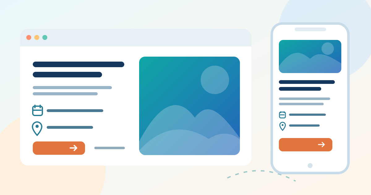
Make the event name the main heading. Put the concrete date and place near it, then a brief explanation of why someone would attend. A decorative slogan may support that explanation, but should not replace it. Keep essential words as page text rather than embedding the only copy in a poster image. Use the worksheet to compare the desktop and phone order before design approval.
3. Match the main button to the live destination
Choose one primary action for the current event state. “Choose tickets” should reach the correct event or date selection; “Join the interest list” should reach a real interest form, not a checkout. If a second action is needed, such as viewing the programme or access details, label it for that different task. Record the button text, destination URL, owner and test date. W3C explains that a link’s purpose must be understandable from its text or programmatically determined context.[1]
4. Test the published hero, not only the design file
Open the public page on a phone and a wide screen. Check that the date, place and button remain readable, the image crop does not hide information, and the text reflows without sideways scrolling. If words sit on a photograph, inspect their contrast across the actual crop; W3C identifies insufficient contrast on background images as an accessibility failure. Follow the button with a keyboard and as a new visitor, then confirm the next page shows the same event and current sales state. Recheck the hero after a date, venue or ticket-link change.[2][3]
Sources and further reading
- Understanding Link Purpose (In Context)W3C Web Accessibility Initiative · Accessed
- Understanding ReflowW3C Web Accessibility Initiative · Accessed
- Failure F83: Background images without sufficient text contrastW3C Web Accessibility Initiative · Accessed